Use the Graph Series Property Panel to view and edit the properties of graphs including the, Line Graph, Area Graph, Bar Graph, Box and Whisker Graph, Bubble Chart, Confidence Graph, Correlation Graph, Pie Chart, Pyramid Graph, and Scatter Chart.
The setup for graphs is broken into three parts. This panel lets you set up the basic type of graph and the series that will be displayed, Graph Settings Properties Panel lets you control labeling and layout, and theGraph Styles Tab of the Properties Panel lets you set fonts and colors.
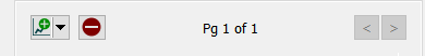
To view the graph's Properties Panel, click on the graph in Edit ![]() mode. In Explore or Experiment mode, double-click the graph. If it is not already selected click, on the
mode. In Explore or Experiment mode, double-click the graph. If it is not already selected click, on the ![]() tab.
tab.
Graphs are displayed in containers that can have a number of pages consisting of graphs and tables. The properties panel will open on the currently visible page, and you can navigate to other pages using the < and > buttons on the panel. Use the ![]() button to add a new graph page after the current page, and the
button to add a new graph page after the current page, and the ![]() button to remove the currently visible page. You can add a table by clicking on the
button to remove the currently visible page. You can add a table by clicking on the ![]() in the dropdown and selecting Add a New Table (this will open the Table Properties
in the dropdown and selecting Add a New Table (this will open the Table Properties
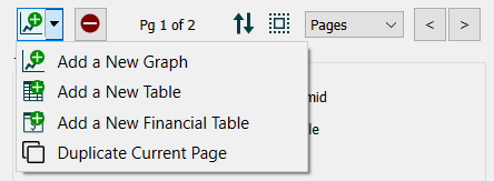
You can also add a new graph, financial table (interface only) or duplicate the current graph or table which will add a new page identical to the current page.
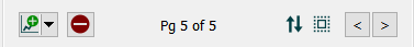
You can create as many pages you want. As you add or navigate, both the page you're on and the total number of pages will be displayed. Once you add more than one page to a graph you will also see a button ![]() that allows you to edit multiple pages:
that allows you to edit multiple pages:
Editing multiple pages will display a subset of the graph properties for all pages in the graph. Any changes you make will be applied to all of the contained graphs. Containers with both graphs and tables will not have any properties in common to change.
You can reorder pages by clicking on ![]() and rearranging the sequence in the Reorder Pages
and rearranging the sequence in the Reorder Pages
See Pages Styles (Interface)for more discussion of the pages.
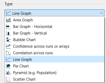
Select the type of graph you want to create. Each of the types has options associated with it to change its appearance and behavior.
Tip: To create a confidence graph select the Plot confidence values check box under Graph Options, below.
Scatter – Select this option to chart the values of one variable versus another, as these values change over time, or at a point in time. When you select this option, you can select only two variables (one for the x axis and one for the y axis). See Scatter Chart for more discussion.
The available options depend on the graph type and are discussed in the individual graph types (Line Graph, Area Graph, Bar Graph, Box and Whisker Graph, Bubble Chart, Confidence Graph, Correlation Graph, Pie Chart, Pyramid Graph, and Scatter Chart).
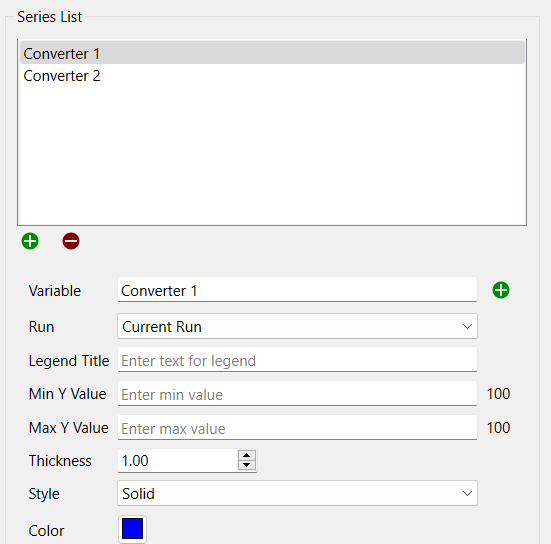
This list lets you select the variables to be displayed in the graph, and the way in which they're displayed. Not all of the choices are available for all of the graph types. A variable, along with the associated information for displaying it, is called a series. Use the ![]() button to add a new series or the
button to add a new series or the ![]() button to remove the selected series from the graph (this doesn't change the model itself, only the graph). If you have selected a series with a * in it, the
button to remove the selected series from the graph (this doesn't change the model itself, only the graph). If you have selected a series with a * in it, the ![]() button will appear. This will expand the * showing each of the individual elements (e.g. sales[North], sales[South] from sales[*]). For Scatter and Bubble graphs, the
button will appear. This will expand the * showing each of the individual elements (e.g. sales[North], sales[South] from sales[*]). For Scatter and Bubble graphs, the ![]() button will delete pairs or triplets of series and the
button will delete pairs or triplets of series and the ![]() button will add to the incomplete elements of the series pair or triplet.
button will add to the incomplete elements of the series pair or triplet.
Variable is the model variable to plot. You can type in a value (you'll be prompted for a name), drag a value from the Find window, or Ctrl-drag (⌘-drag on Mac) a variable from the model diagram.
Note If you select a * for the variable name it will leave the * in the name in the list, and only expand it when displaying the graph. This way, change array elements will automatically update the graph. To set colors and other things on individual elements use the
button to expand the list.
Note You can also add variables to a graph by dragging them onto the graph, directly on the model itself.
Run lets you select which run to display the results for. The default is Current Run, which will give the results for the most recently created run. If you choose a named run, the results displayed won't change as new runs are made (nor will they be erased if you restore all devices).
Legend Title is the title that will be displayed for the series, either on the right or at the bottom, depending on your choice under Graph Options below. If you have specified a slice interval in the Graph Settings Properties Panel then this is a comma separated list of legend labels such as 2019,2020,2021,2022.
Min Value is the minimum value to use for the Y axis. Leave this empty to let the software choose a value. If a run has been made, the smallest value of the variable across all runs and times is displayed to the right.
Max Value is the maximum value to use for the Y axis. Leave this empty to let the software choose a value. If a run has been made, the largest value of the variable across all runs and times is displayed to the right.
Note: When min and max are left blank the software will choose minimum and maximum values based on run results, unless a global minimum or maximum has been set on the Scales and Ranges Properties panel.
Note If there are multiple variables using the same scale setting the minimum or maximum for one will set the scale for all. If more than one variable has a scale set the biggest max and smallest min will be used.
Note If you set a min and max the rounding option for scales is ignored and the min and max you set are used directly.
Line Appearance
To set line appearance on comparative graphs, use the Global Graph Styles Properties Panel for the model. These are the same for all comparative graphs. Not all options are available for all graph types.
Thickness is the line thickness, in points, to be plotted. Choose a value, starting at 0.5. You can either type in a number, or use the dial to raise or lower the value.
Style is the line style to be used in drawing the curve(s). Choose between Solid, Dash-Dot, Dashed, and Dotted.
Color is the color to be used when displaying the series. Click on the square to change the color.
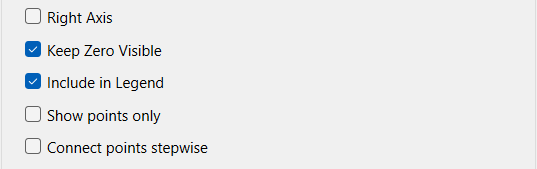
Right Axis, if checked, causes the scale for the selected series to be displayed on the right axis. If it's not checked, the scale will be displayed on the left axis. Not available for comparative.
Keep Zero Visible, if checked, will force the scale to include 0 (at the bottom, for positive variables).
Include in Legend, if checked, will include the variable in the legend for the graph. Uncheck this to selectively remove variables from the legend. You can remove the entire legend on the Graph Settings Properties Panel.
Show points only, if checked, will display each data points, but not connect them. This is very useful when working with data which may be measured irregularly.
Connect points stepwise, when checked, will display the graph as a series of horizontal and vertical line segments rather than interpolating between data points. These two are not noticeably different except when the save interval is relatively large.
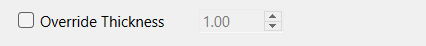
Override Thickness, if checked, will set the line thickness for each graph line to the value you specify. This is only available for comparative graphs.
Choose a variable in one of the following ways: