The Correlation Graph shows you the relationship between different model variables over time. The variables will often be inputs to sensitivity specified in the Sensitivity Specs Panel and key model outputs, though you can show the correlation between any two variables. Because the correlation is shown over time you can see how constants impact outputs in both the short and long term.
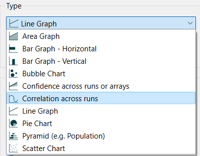
Select the graph ![]() from the Interface Build toolbar, and click on the page at the location you want it to appear (you can also add a page to an existing graph you've already put down). On the graph panel, select type Correlation across runs.
from the Interface Build toolbar, and click on the page at the location you want it to appear (you can also add a page to an existing graph you've already put down). On the graph panel, select type Correlation across runs.
Note Correlation graphs are designed for use with Sensitivity Runs. While you can get output as long as there is has been more than one run created, the interpretation of the resulting graph is difficult for small numbers of runs.
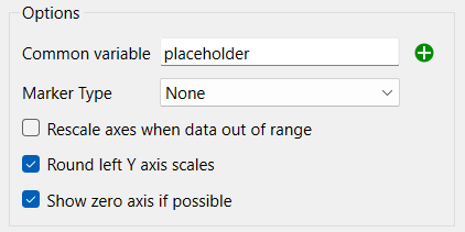
Common variable is the model variable for which each of the variables in the series list will have its correlation computed. This is often a Placeholder (see Placeholders) that contains the sensitivity input parameters to allow switching amongst them, but can be any model variable.
The remaining options are the same as they are those for Line graphs and are described in Graph Series Property Panel. correlation always range between -1 and 1 so the scaling options may not be that useful.
The correlation graph looks the same as a Line Graph, but the interpretation of the lines is different.
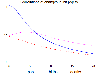
This graph is from an uncertainty run where initial population, the birth rate, and the death rate are sensitivity parameters. As we would expect, initial population has a correlation of 1 with population initially, but that correlation decreases over time. Similarly, initially only the initial population and the birth rate impact births, and the initial population explains half of it for a correlation of 0.5, which decreases over time. The correlation with deaths also start at 0.5, but it actually goes up for a time because a higher population leads to more births which increases population leading to more deaths - though eventfully the impact diminishes.
Understanding the sources of the correlations and the way they change may take some study, but it is relatively easy to identify which variables have correlations worth studying with this chart.
Note If either the common variable or the output variables is constant across the different runs the correlation will be reported as 0, even if one of the variables is equal to the other.
The series and display options as well as the styles for the correlation graph are the same as those for other graphs (see Graph Series Property Panel, Graph Settings Properties Panel, and Graph Styles Tab for more discussion).
The colors for the area graph will follow the color sequence set for the model (see Global Graph Styles Properties Panel), but you can specify the color used for each variable directly.