 in the upper right hand corner of the graph or table.
Graphs, tables, group inputs, and array inputs all support multiple pages, so that a single location can provide access to a number of different objects or values.
With the exception of the array input, which generates multiple pages based on the dimensions of the variable being used, pages are added and removed at the top of the property panel for the object you're creating.
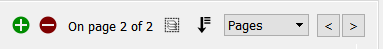
If you have multiple entries in an object, then you can navigate between them. For graphs and tables, in the model, this is done using the back and forward buttons in the upper right hand corner of the graph or table.
On the interface, you can choose between three different styles for navigation between pages:
Use the arrows to go to the previous and next page (same as on the model). If you're at the first page, back takes you to the last; if you're on the last page, forward takes you to the first.
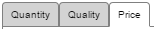
Click on a tab to see the content. If you have a small number of pages, this makes it easy to see all of them at a glance, and to go to the desired one with a single click.
You can set the appearance of Tabs as noted below.

Click on a dropdown to see the pages. Once you click on the dropdown, the full list of pages will be visible. This works well when you have a significant number of pages.
By default, the dropdown will be the same as the graph title. You can override this and specify your own label for the tab or dropdown by clicking on the  tab and setting "Selection Label" in the
Adding and removing pages works the same on the model and the interface. When working on the model, the dropdown that lets you select the page navigation style won't be visible. When you have a single page, you'll see:

Use the  button to add a new page after the current page, and the
  button to remove the currently visible page. You can create as many pages you want. As you add or navigate, both the page you're on and the total number of pages will be displayed.
Click on the Pages dropdown ( ) to select between Pages, Tabs, and Dropdown, as described above.
Once you add more than one page, you'll also see an icon ( ) to edit multiple pages:
Editing multiple pages will display a subset of the properties for all pages in the container. Any changes you make will be applied to all of the contained graphs, tables, or inputs.
You can reorder pages by clicking on  and rearranging the sequence in the Reorder Pages
To change the appearance of tabs click on the  tab of the panel with the graph pad, group input, or arrayed input you are working on. Near the bottom is a Container Settings group. Open this if it is not already open. If you have selected dropdown as described above only the container text option will be available.
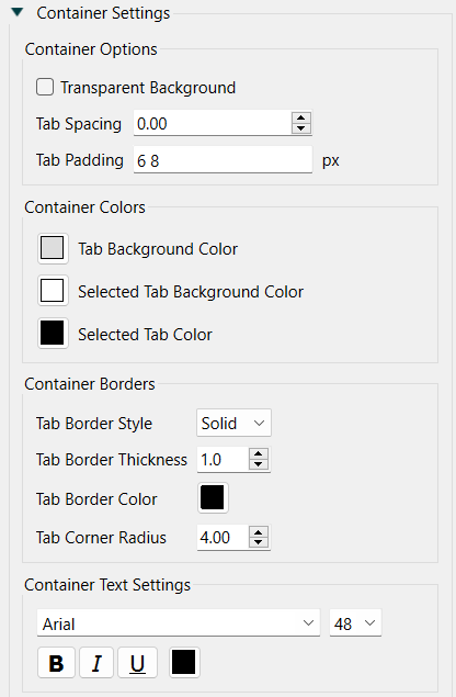
Transparent Background, if checked, will draw only the text of the tabs and use the background from whatever is on the page at that location. Use this only for special effects as it makes it difficult to determine which tab is active.
Tab Spacing determines the distance separating tabs. The default of 0 will place the tabs one right next to another.
Tab Padding determines the location of the text within the tab, as well as the overall height and width of the tabs. You can specify 1 number for all directions, 2 for vertical and horizontal, or all 4 for top right bottom left. Separate the numbers by spaces. This is the same as the padding convention for CSS.
Tab Background Color sets the background color of tabs that are not selected. This value is ignored if transparent background is checked.
Selected Tab Background Color sets the background color of the single tab that is selected. This value is ignored if transparent background is checked.
Selected Tab Color sets the text color for the single tab that is selected. The text color for the other tabs is set under Tab Text Settings below.
Border Style is one of Solid or None. If you select None, the thickness and color selections will have no effect.
Border Thickness is the thickness of the border in pixels. This has an effect only if the border style is solid.
Border Color is the color of the border. Click on the color button ( ) to select a color.
Corner Radius determines the rounding of the shape (on top). Use 0 to create a square shape. Use a larger number to make the shape more rounded. Note that a large corner radius may change the amount of text that is visible and require adjustment of margins.