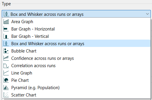
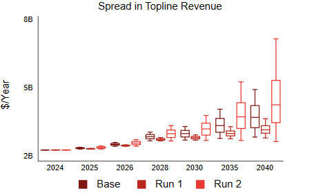
Box and whisker graphs are a common way to represent uncertainty that allows comparison across different variables or runs. They derive their name from the way they are drawn.
Select the graph ![]() from the Build toolbar, and click on the page at the location you want it to appear (you can also add a page to an existing graph you've already put down). On the graph panel, select type Confidence across runs or arrays.
from the Build toolbar, and click on the page at the location you want it to appear (you can also add a page to an existing graph you've already put down). On the graph panel, select type Confidence across runs or arrays.
Then select the variables you want to appear in the box and whisker chart. You can include any variable you want, but only a single variable for comparative. For more information on adding variables, see Graph Series Property Panel
Box and whisker graphs display the range of outcomes realized across a number of different computations. You can select one variable and look at the outcomes over different runs, or you can select * for an array and look at the outcomes over different elements. The second case makes it possible to compare different runs by, effectively, running a sensitivity simulation for each run. For more information on doing this see Eberlein & Schoenberg (and the model). Though this is not the only way to use box and whisker graphs across array elements, it is the most common.
If you select * as the array element (and All as the array operation) then the computations will take place across the array elements for the current run (or runs if using comparative). If you select a single element, the computations will take place across all runs (normally after Performing Sensitivity Analysis), and the option to view comparative results will not be available.
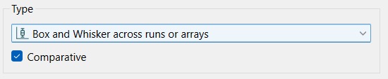
Comparative, if checked, will display the output at each time as a cluster of boxes with different colors.
Note Comparative is only available if you selected an array as the variable.
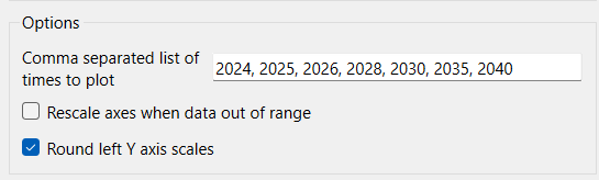
Comma separated list of times to plot specifies at which times to show results. The values should be increasing (and will be drawn that way in any case) but need not be uniformly distributed.
Rescale axes when data out of range, if checked, will always show all available data. If this is not checked, and minimum or maximum values have been set for some variables the values may be truncated (their lines will not be drawn outside the specified range).
Round left Y axis scales, if checked, will round the values in the associated Y axis so that the scales are easier to read. If not checked no adjustment will be made.
The series and display options as well as the styles for the area graph are the same as those for other graphs (see Graph Series Property Panel, Graph Settings Properties Panel, and Graph Styles Tab for more discussion).
The colors for the area graph will follow the color sequence set for the model (see Global Graph Styles Properties Panel), but you can specify the color used for each variable directly.