The pyramid graph is similar to two horizontally oriented bar graphs set up side by side. The most common usage is as a population pyramid, where the bars are by age and the two sides are used for female and male. The pyramid graph shows values at a given time, either the simulation time, or the scrub time, as set in the Run Toolbar. As you simulate a model, the pyramid graph will update.
Pyramid graphs require arrayed variables, typically of two or more dimensions (though it is possible to use two one dimension arrays rather than two parts of a single array). The most common example will be for population. Suppose Age has values Age_1, Age_2, ... Age_85, Age_Older and Sex has values Female, Male. Then Population would be arrayed by Age and Sex with each sex having 86 different age values.
You could also set up two different variables to be used on the different sides of the pyramid graph. Still using the above example you might have urban and rural populations as two separate variables and then show these in a pyramid graph.
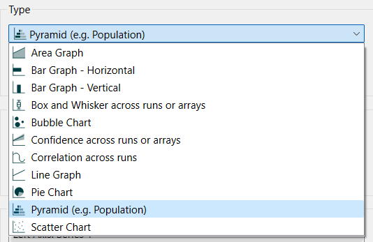
Select the graph ![]() from the Interface Build toolbar, and click on the page at the location you want it to appear (you can also add a page to an existing graph you've already put down). On the graph panel, select type Pyramid at the top.
from the Interface Build toolbar, and click on the page at the location you want it to appear (you can also add a page to an existing graph you've already put down). On the graph panel, select type Pyramid at the top.
The selection of variables is slightly different from they way it works with most other graphs as described in Graph Series Property Panel
.
When you click on the ![]() button to add a variable, you will be prompted to pick one using the find dialog. You will need to choose an arrayed variable. Suppose that is population, as discussed above. After selecting it you will be asked to choose subscripts:
button to add a variable, you will be prompted to pick one using the find dialog. You will need to choose an arrayed variable. Suppose that is population, as discussed above. After selecting it you will be asked to choose subscripts:
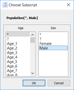
Choose * for age. This will form the basis for setting up the bars. Then choose Male for the Sex subscript. The first addition will be the left side content:
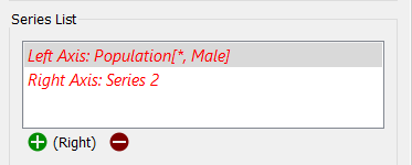
Click on the ![]() button again to choose the right side. This will also be Population, but this time choose Female as the sex. then click on the
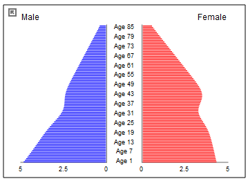
button again to choose the right side. This will also be Population, but this time choose Female as the sex. then click on the ![]() button to open the Graph Settings Properties Panel and add Male for the left label and Female for the right label. You will get a graph (depending on your data) such as:
button to open the Graph Settings Properties Panel and add Male for the left label and Female for the right label. You will get a graph (depending on your data) such as:
You can only add one set of values for display (always paired).
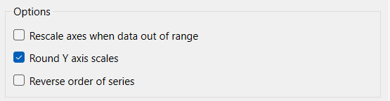
Rescale axes when data out of range, if checked, will always show all available data. If this is not checked, and minimum or maximum values have been set for some variables the values may be truncated (their lines will not be drawn outside the specified range).
Round left/right Y axis scales, if checked, will round the values in the associated Y axis so that the scales are easier to read. If not checked no adjustment will be made.
Note This option does not affect any variable for which an individual minimum or maximum has been specified in either the graph definition or the scales and ranges panel for the variable itself.
Reverse order of series, if checked, will flip the displayed pyramid vertically - e.g. showing youngest to oldest instead of oldest to youngest.
The series and display options as well as the styles for the correlation graph are the same as those for other graphs (see Graph Series Property Panel, Graph Settings Properties Panel, and Graph Styles Tab for more discussion).
The left will use the color set for the first graph series, the right that for the second graph series as you have set for the model (see Global Graph Styles Properties Panel), but you can specify the color used for each variable directly.