The Bubble Chart is a graph type that allows you to display 3 dimensions of data with the first two being shown on the X and Y axes and the third being represented by the size of the bubble. This is effectively an extension of the Scatter Chart which shows only the X and Y components.
The Bubble Chart can show values at a given time, or values at multiple times. The time of display is the simulation time during simulation, and the scrub time, as set in the Run Toolbar, afterward. As you simulate or drag the scrub time, the Bubble Chart will update.
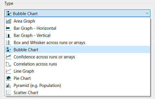
Select the graph ![]() from the Interface Build toolbar, and click on the page at the location you want it to appear (you can also add a page to an existing graph you've already put down). On the graph panel, select type Bubble at the top.
from the Interface Build toolbar, and click on the page at the location you want it to appear (you can also add a page to an existing graph you've already put down). On the graph panel, select type Bubble at the top.


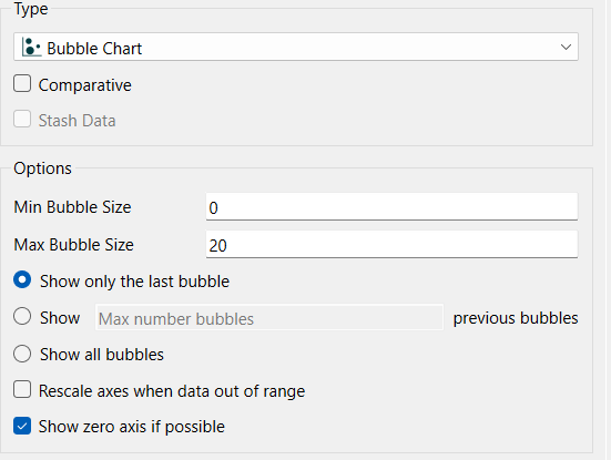
Use Comparative to display a bubble for each run (only available for a single series). See Stash Data for information on the Stash Data option.
You can specify the minimum and maximum size of bubbles, as well as how many to display for each series.
Min Bubble Size is the smallest size in pixels that bubbles can be. If this is set to 0 (the default) the nothing will be drawn when the z variable (see below) is less than or equal to 0.
Max Bubble Size is the smallest size in pixels that bubbles can be. The best value here depends on the size of the graph. The default of 20 is appropriate for small and medium sized graphs.
Bubble Persistence lets you specify how many bubbles are drawn for each series (see below).
Show only the last bubble, if selected, will draw the values at the simulation or scrub time and nothing else.
Show ___ previous bubbles, if selected, lets you specify how many bubbles are shown. Fill in the number of bubbles in addition to the one for the current values that should be drawn. During early parts of the simulation the number of values may be limited so this is effectively the largest number of additional bubbles that will be drawn.
Show all bubbles, if checked, will display all of the available bubbles.
Rescale axes when data out of range, if checked, will always show all available data. If this is not checked, and minimum or maximum values have been set for some variables the values may be truncated (their lines will not be drawn outside the specified range).
Show 0 axis if possible, if checked, will display a horizontal gridline at 0. This option only matters when the minimum on the graph is negative and the maximum positive, otherwise the gridline would be displayed anyway.
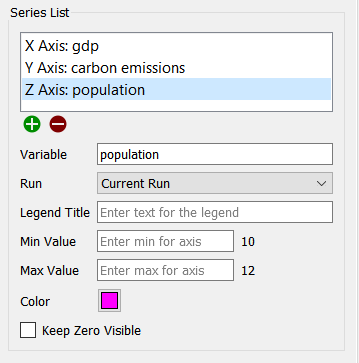
The series list for a Bubble chart keeps entries in triples - x, y, z. You can have multiple series, but each series needs to have all three components.
Note While you can combine multiple series (or use the comparative option) with the display of more than one bubble per series, this can quickly become difficult to interpret.

Use the ![]() button to add entries into the current series and also to add a new series. When there is an incomplete series, you can add X, Y or Z to the series using this button. Once the series is complete, you can add a new series using this button (you will not be able to add a new series if you have selected comparative).
button to add entries into the current series and also to add a new series. When there is an incomplete series, you can add X, Y or Z to the series using this button. Once the series is complete, you can add a new series using this button (you will not be able to add a new series if you have selected comparative).
Use the ![]() to delete the currently highlighted series. Note that this will take away all 3 components of the series. To replace one component, click on the component and then change the variable being used in the Variable entry.
to delete the currently highlighted series. Note that this will take away all 3 components of the series. To replace one component, click on the component and then change the variable being used in the Variable entry.
Variable is the model variable to be displayed for the currently selected component in the Series List. You can edit this using autocomplete, and also drag values in from the model or Find.
Run lets you select which run to display the results for. The default is Current Run, which will give the results for the most recently created run. If you choose a named run, the results displayed won't change as new runs are made (nor will they be erased if you restore all devices).
Legend Title is the title that will be displayed for the series, either on the right or at the bottom, depending on your choice under Graph Options below.
Min Value is the minimum value to use for the axis corresponding to the currently selected item. Leave this empty to let the software choose a value. If a run has been made, the value that the software would use is displayed to the right.
Max Value is the maximum value to use for the axis corresponding to the currently selected item. Leave this empty to let the software choose a value. If a run has been made, the value that the software would use is displayed to the right.
Note: You only need to set the min and max values on the first series. If you set them on multiple series the software will take the minimum of the minimums and the maximum of the maximums.
Note: The software will choose minimum and maximum values based on run results, unless a global minimum or maximum has been set on the Scales and Ranges Properties panel.
Keep Zero Visible, if checked, will force the scale to include 0 (at the bottom, for positive variables)
Color will determine the color of the bubbles for the selected series (click on the Z axis component to set this). The default is drawn from the color sequence specified in Global Graph Styles Properties Panel.
The series and display options as well as the styles for the area graph are the same as those for other graphs (see Graph Series Property Panel, Graph Settings Properties Panel, and Graph Styles Tab for more discussion).
The colors for the area graph will follow the color sequence set for the model (see Global Graph Styles Properties Panel), but you can specify the color used for each variable directly.