The bar graph is a variation of the graph tool that allows you to display values as different height or width bars. The bar graph shows values at a given time, either the simulation time, or the scrub time, as set in the Run Toolbar. If you selected the stacked bar option discussed below you can also display bars at multiple times. As you simulate a model, the bar graph will update.
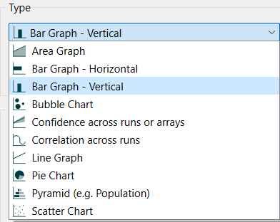
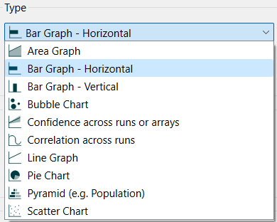
Select the graph ![]() from the Interface Build toolbar, and click on the page at the location you want it to appear (you can also add a page to an existing graph you've already put down). On the graph panel, select either Bar Graph - Horizontal (to have the width of each bar reflect value), or Bar Graph - Vertical (to have the height of each bar reflect value).
from the Interface Build toolbar, and click on the page at the location you want it to appear (you can also add a page to an existing graph you've already put down). On the graph panel, select either Bar Graph - Horizontal (to have the width of each bar reflect value), or Bar Graph - Vertical (to have the height of each bar reflect value).
Then select the variables you want to appear in the bar graph. You can include any variables you want. For more information on adding variables, see Graph Series Property Panel.
You can have the bars displayed vertically or horizontally. To do this choose Horizontal or Vertical for the type.
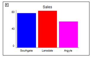
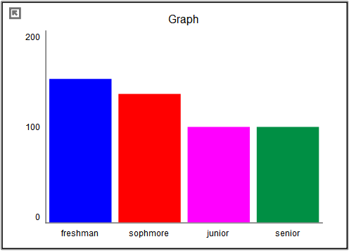
Choose Bar Graph - Vertical to see values that vary by height:
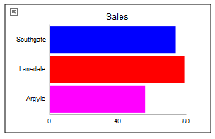
Choose H Bar to see values that vary by width:
The content, options and styles are identical for the two types of bar graphs.
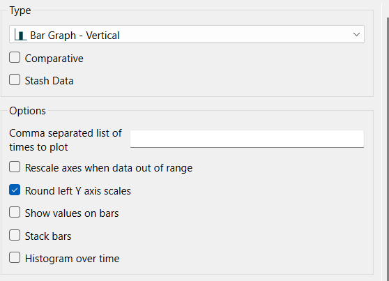
Comparative, if checked, shows multiple simulation runs on a single graph. This option is often used in conjunction with sensitivity analysis. When comparative graphs are generated and sensitivity analysis is turned on, clicking the ![]() button at the top of the graph displays a journal of the most recent sensitivity setup used to create the graph. See Sensitivity Parameters dialog (Model Only) for more information. Comparative is only available when there is 1 variable selected. When you add a second variable it will be grayed.
button at the top of the graph displays a journal of the most recent sensitivity setup used to create the graph. See Sensitivity Parameters dialog (Model Only) for more information. Comparative is only available when there is 1 variable selected. When you add a second variable it will be grayed.
Stash Data, if checked, will provide a stash button on the graph to remember any variables displayed for the current run. See Stash Data for information on this option.
Comma separated list of times to plot allows you to enter a sequence of time values at which to display bars. This option is only available for Bar graphs (not H Bar graphs). There is no limit on the number of time points, but keeping this relatively small will improve the readability of the graphs. If this is left blank then values at either the simulation time, or the scrub time, as set in the Run Toolbar will be shown. If there are multiple bars at each time, they will be grouped to clearly separate the different time points.
Round Y axis scales, if checked, will round the values in the associated Y axis so that the scales are easier to read. If not checked no adjustment will be made.
Note This option does not affect any variable for which an individual minimum or maximum has been specified in either the graph definition or the scales and ranges panel for the variable itself.
Show values on bars, if checked, will display the value on top of the bars when scrubbing. If this is not checked the values will only be shown in the legend.
This option is only available for the bar graph when displayed vertically (not horizontally). When selected, rather than displaying one bar for each variable in the graph, it will display the variables stacked in a single bar as they are in the Area Graph. Stacked bar graphs can be made comparative, even with multiple variables and times. There will also be additional options available:
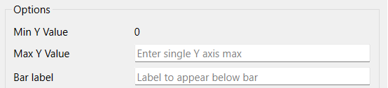
Min Y Value is the minimum value to use for the Y axis. This is always 0 for a stacked bar graph.
Max Y Value is the maximum value to use for the Y axis. Leave this empty to let the software choose a value.
Bar Label specifies the label to be used for the bar. If left blank, no label appears. When more than one time point is displayed the label is ignored and the time values are used as labels. When the comparative option is selected the run names are used as the labels and this value is ignored.
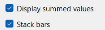
Displayed summed values, if checked, will show scrub values (displayed by dragging over the bars) that are the sum of the values and those below - matching the y axis values. If this is not checked, the values displayed will be those of each variable. Scrub values will be displayed in the legend, or on the bars if the option for no legend has been selected in Graph Settings Properties Panel.
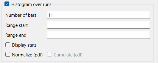
A histogram over runs is only available when selecting comparative, not selecting stacked, not specifying times, and having only a single variable. It will display a histogram across runs for the selected variable at the display time.
A histogram over time is only available when not selecting comparative, not selecting stacked, specifying times, and having only a single variable. It will display a histogram across the specified times for the selected variable and the selected or current run.
When you select this option a number of additional options become available. See the example below.
Histogram over runs/Histogram over time, if checked, will present the Bar graph by grouping the values in each simulation and then displaying the number of occurrences in each group. If comparative has been selected the label will be Histogram over runs, if not the label will be Histogram over time. If checked, the below options will also be enabled.
Number of bars specifies the number of bars that will be displayed. In general, the larger the number of simulations (or times) there are, the larger the number of bars that can be meaningfully displayed.
Range start, if specified, indicates the smallest value that will be considered in counting values for bars. Any results below this number will be ignored. You can use this, combined with Range end and the number of bars, to control the way values are grouped. For example, running from 0 to 100 with 5 bars will group values in increments of 20 [0-20), [20-40) and so on. Leave this blank to let the software choose groups that will ensure that values will not be excluded because they are too small.
Range end, if specified, indicates the largest value that will be considered in counting values for bars. Any results above this number will be ignored. Leave this blank to let the software choose groups that will ensure that values will not be excluded because they are too large.
Display stats, if checked, will display statistics related to the information presented in the bars.
Mean is the algebraic average of the values.
Min is the minimum of all values.
Median is the value for which half of the values are above, and half below.
Max is the maximum of all values.
Std. Dev. is the standard deviation of the counted values.
25% Percentile is the value that is larger than 25% of all values (and smaller than 75%).
75% Percentile is the value that is larger than 75% of all values (and smaller than 25%).
Interquartile Range is the different in value between the 75th and 25th percentile.
Normalize (pdf), if checked, fill normalize the count so that it shows relative frequency rather than the number of occurrences. This allows you to create probability density functions that are independent of the number or runs (or times) used to create the histogram.
Cumulate (cdf) if checked, presents the normalized histogram by adding the value of the previous bar when displaying the current bar. This will create a cumulative density function with the last bar, by construction, having a value of 1.
The series and display options as well as the styles for the area graph are the same as those for other graphs (see Graph Series Property Panel, Graph Settings Properties Panel, and Graph Styles Tab for more discussion).
The colors for the area graph will follow the color sequence set for the model (see Global Graph Styles Properties Panel), but you can specify the color used for each variable directly.
Stacked bars are a very effective way to display multiple variable comparisons over time and potentially across runs:
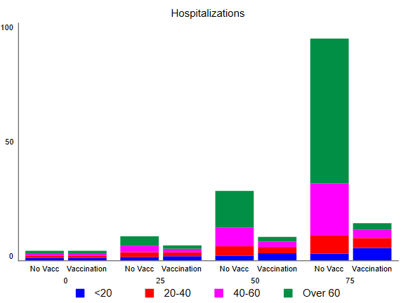
In this case the age groups are array elements, while No Vacc and Vaccination are run names.
The colors for the bars will follow the color sequence set for the model (see Global Graph Styles Properties Panel), and you can also specify the color used for each variable directly.
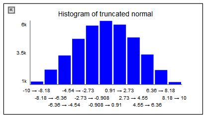
In addition to displaying the values of variables, the bar graph can be configured as a histogram when there it contains only a single variable. In this to display the number of times different values occur for a specific variables either across runs (as a comparative graph) or across time. The histogram is a very useful tool for understanding the range and distribution of values.
Histograms can be configured to display the raw count of values, or to normalize those so that the total over all of the bars adds up to one. The latter is very useful for looking at different numbers of runs or times without having to adjust for scale mentally. There is also an option to display a cumulative hectogram.
For example, suppose that we looked at values of a truncated normal distribution across time. The raw histogram shows the variable ranges from -10 to 10 and would reflect the full set of values (40,000 in this case).
We can ask to normalize the graph in order to display a probability density function:
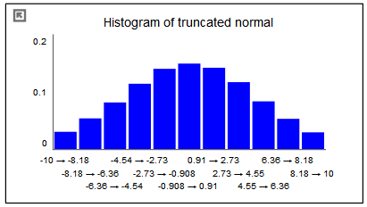
This graph is identical except for the scales. The total of all the bars will now add up to one.
By selecting the cumulate option, we can see the cumulative density function:
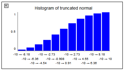
The first bar in this graph is the same as in the previous graph (though the scales are different). Each successive bar is created by adding the value of the bar from the previous graph. Thus, the final bar in the normalized cumulative histogram always has a value of 1.
The options to create and customize histograms are available from the Graph Series Property Panel.
Note The histogram selection is available only when there is a single variable. Once you select histogram you will not be able to add variables.