 mode. In Explore or Experiment mode, double-click the graph. If it is not already selected, click on the
  tab.
tab.Use the Graph settings Properties Panel to view and edit the layout and appearance of graphs including the, Line Graph, Area Graph, Bar Graph, Box and Whisker Graph, Bubble Chart, Confidence Graph, Correlation Graph, Pie Chart, Pyramid Graph, and Scatter Chart. The setup for graphs is broken into three parts. This panel lets you control labeling and layout, the Graph Series Property Panel lets you set up the basic type of graph and the series that will be displayed, and the Graph Styles Tab of the Properties Panel lets you set fonts and colors. (See Getting Started Online for differences in online editing).
To view the graph's Properties Panel, click on the graph in Edit mode. In Explore or Experiment mode, double-click the graph. If it is not already selected, click on the tab.
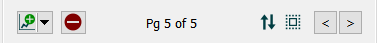
Graphs are displayed in containers that can have a number of pages. The properties panel will open on the currently visible page, and you can navigate to other pages using the < and > buttons on the panel. Use the  button to add a new graph page after the current page, and the
  button to remove the currently visible page. You can create as many pages you want. As you add or navigate, both the page you're on and the total number of pages will be displayed. Once you add more than one page to a graph you will also see a button
  that allows you to edit multiple pages:
Editing multiple pages will display a subset of the graph properties for all pages in the graph container. Any changes you make will be applied to all of the contained graphs.
You can reorder pages by clicking on  and rearranging the sequence in the Reorder Pages
See Pages Styles (Interface)for more discussion of the pages.
Not all options shown here are available for all graph types, and some graph types have additional options described below.
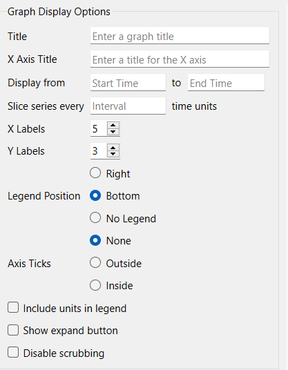
This lets you select the options for displaying the graph.
Title is the title that will be displayed at the top of the graph.
Selection Label is the label that will be used when tabs or a dropdown is used to select different graphs. This is available only on the interface.
X Axis Title is the title that will be displayed at the bottom of the graph.
Display Time Range
Display from ... to ... allows you to narrow the time range that will be displayed in the graph as well as set x-axis scales. Leave this blank to display everything available, or include values to display less. Any values from before the first time or after the last time specified will be ignored.
Note If you move the slider in the run tool bar to a time before the last time the values displayed will stop at the time displayed in the toolbar.
or window of ... time units from end will display values from the last time minus the entered value till the end of the display. When scrubbing time on the Run Toolbar this displays a moving window of values.
or slice series every ... time units will break up a single series by the interval and then overlay the resulting shorter series. This is useful to do period-on-period comparisons over the course of a simulation (for example comparing 2019, 2020, and 2021). If this is filled in the Legend Title on the Graph Series Property Panel is specified as a comma separated list of labels for each segment. This option is only available for line graphs with a single variable that are not comparative.
Vertical line at ... with label ... will display a vertical line at the indicated time with an optional label drawn vertically to the left of the line. Click on the color button
on the right to set the line color.
X Labels determines the number of labels that will be displayed along the X axis. Use 0 to hide the labels, or a number 2 or greater.
Y labels determines the number of labels that will be displayed along the Y axis. Use 0 to hide the labels, or a number 2 or greater.
Fill Intensity (area graphs only) determines how opaquely the area between the graph lines is filled in. Use 0 to have only the graph lines show, or 1 to have the graph lines and the fill between the lines the same color. Generally a small value such a 0.1 will work best.
Legend Position determines where the legend for the series identifiers will appear. Select Right, Bottom, or No Legend (to hide the legend).
Axis Ticks determines whether and where to place ticks on the graph axis. Select None for no ticks, Outside for small ticks between the graph boundary and the axis labels, and Inside for small ticks away from the axis labels. The Ticks will be placed at the same locations as the axis labels for both the X and Y axis.
Marker Type, xxx if selected, will display the number 1 on the first series, 2 on the second, and so on. This can be helpful in distinguishing series when colors and line styles are not sufficiently distinct.
Include units in legend, if checked, will include the units of measurement for the variable in the legend. This option isn't available for comparative graphs, as the legend entries in that case will be run names and not variable names.
Note: The left and right axis titles under Connect Dots below are a very helpful place to put units.
Show Expand Button (interface only)
Check this to show an expand button on the graph. This will allow an interface user to make a bigger version of the graph and zoom the axis (see Expanded Graph dialog (interface only)). If the fonts used are small, these will also enlarge to make it easier to read the graph.
Disable scrubbing, if checked, will stop the display of values when the user scrubs (holds down the mouse button and drags the mouse) across the graph. This is helpful for very small graphs where displaying values is not readable.
Scatter Graphs
There is an additional setting for the scatter chart:

Auto Scale X Axis, if selected, will round values on the X axis to make them more readable.
See Scatter Chart for more detail.
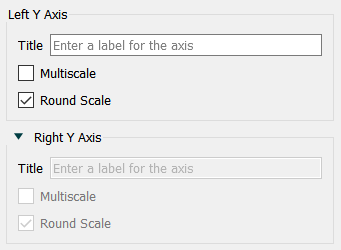
Use these entries to control the appearance of the Left and (optionally) Right axes. The right axis options are available only if you've included a series with Right Axis checked, under Series List above.
Title is the title that will be displayed next to the axis, with vertical text. If this is left blank, no title will be displayed.
Multiscale, if checked, will cause each series to be displayed with a separate scale. If this isn't checked, all series will be displayed on the same scale (though the left and right axes will always be on different scales).
Round Scale, if checked, will cause the software to use round numbers on scales to make the values easier to read. This only applies if no scale has been set for the variables (in the graph or in the scales and ranges panel for the variable).
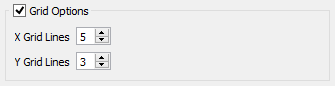
If this option isn't checked, graphs will be displayed with a left and bottom axis only. They will be open on the top and right. If checked, you can specify the number of grid lines.
X Grid Lines specifies how many lines, including the left and right, to display. Setting this the same as X Labels in Graph Options above will create a grid line for each label.
Y Grid Lines specifies how many lines, including the top and bottom, to display. Setting this the same as Y Labels in Graph Options above will create a grid line for each label.
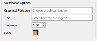
Sketchable options allow you to add a graphical function to the graph and have users sketch the shape of the function on the graph. See Sketchables for more information.
Graphical Function names the variable to sketch. This variable must be a Graphical Function and must have Time as its equation.
Title is the title that will appear in the legend. If left blank, the name of the graphical function will be used.
Thickness is the line thickness of the sketchable curve.
Color is the color of the sketchable curve.