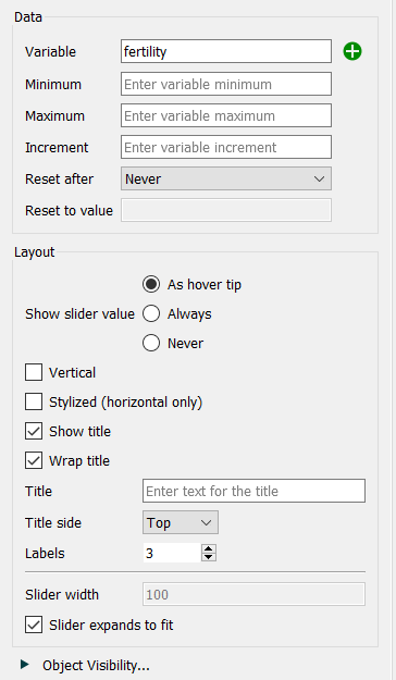
Use a slider to adjust the input values in your model by dragging it from side to side.
You can control the size and color as well as the range over which a slider operates. Sliders can be used with any model variables, but will require activation via the override button (![]() ) for variables that aren't constants.
) for variables that aren't constants.
For more information about placing and editing sliders, see Working with Objects.

Variable specifies the variable the slider will control. Begin typing and autocomplete suggestions will appear, or click on the ![]() , then select the variable you want from the find dialog that appears.
, then select the variable you want from the find dialog that appears.
Minimum specifies the minimum value the slider will take on.
Maximum specifies the maximum value the slider will take on.
Increment specifies the amount the slider will change as it's dragged.
Reset After specifies the time after which the user set value will revert to the "Reset to value" specified below. If this is Never (the default), the value won't reset.
Reset to value specifies the value the variable controlled by the slider will take on after the "Reset after" interval specified above (since the slider was set) is passed.
Show slider value determines whether, and when, the user will see the value of the slider as it is being dragged. This value will be displayed above the slider handle (![]() ), or to the left for vertical sliders.
), or to the left for vertical sliders.
As hover tip will display the slider whenever the mouse is in the vicinity of the slider, including while dragging.
Always will always display the value.
Never will never display the value.
Note Though this value can be set for each slider individually it is best to set all sliders in an interface consistently.
Vertical, if checked, will display the slider vertically instead of horizontally.
Stylized (horizontal only), if checked, will display a stylized slider that will give you control over color:
![]()
Show title, if checked, specifies that text should be displayed with the slider. If you want to customize labeling position you can uncheck this option and use a text box to place a label.
Wrap title, if checked, will wrap the title in order to allow more room for the slider proper.
Title specifies what text will be displayed if the "Show title" checkbox is checked. If blank, the variable name will be used.
Title side specifies which side of the slider the text should be displayed on. This only matters if the check box for "Show title" is checked.
Labels indicates the number of labels the slider should display.
Specifies the width (height if vertical) of the slider, with the label text taking up the remainder of the overall object. This is useful when placing labels on the left to make a sequence of sliders placed vertically line up. Available only when Slider expands to fit is not checked.
Slider expands to fit, if checked, will automatically fit both the text and the slider into the overall object. If it is not checked, the value in Slider Width will be used and the text aligned to the left of the overall object container (so there may be a space between the text and slider). If you specify a width that is too large to fit both the text and slider the value will be ignored.