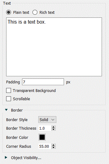
Use the Text Box Properties panel to format the text that appears in a text box.
For text boxes on the interface you can choose whether to use rich text of plain text. Text boxes on the model always use plain text. If you are using rich text and are selecting colors that are very light you can also change the background displayed for editing to make the text easier to read by clicking on the Background button on the Styles Tab, or the page background color if you have asked to make the text box transparent.
Plain text is just what you type, with no bold, italic or font changes. You can still set the font to be used from the Style
tab.
Rich text allows you to change fonts and colors within the message and set text alignment. A simple rich text editor will be displayed if you select this option.
Type in the text that you want to appear. If you leave this blank, the words "Enter text here..." will appear on the model diagram or interface page (and will be blank when published).
Tip: If you want to enter just the box and no text, use a Graphics box.
Padding lets you specify the padding of the text relative to the boundary of the text box. This is most useful when you have specified a visible border.
Transparent Background, if checked, will allow you to place the text box on top of other objects without hiding them.
Note: Clicking on objects behind a transparent text box will select the text box, not the object it appears you're clicking on.
Scrollable, if checked, will scroll the text in the text box. If this is not checked only the top portion of the text will be visible. This option is available only on the interface.
This specifies what border, if any, should appear around the text box.
Border Style can be either Solid or None. If you select None, the remaining settings won't matter.
Border Thickness lets you specify how thick, in points, you want the border around the Graphics box to be. This has an effect only when you've selected Solid for the Border Style.
Border Color lets you specify the color of the border. Click on the displayed color button to select a color. This has an effect only when you've selected Solid for the Border Style.
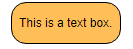
Corner Radius lets you specify how rounded the corners will be. Use 0 for square corners, or a larger number such as 15 to create rounded corners:
Note If you round the corners you may need to increase padding so the text does not go off the displayed area.
In addition to the standard properties described in Styles Tab, the Text box has some style properties not found on other objects.
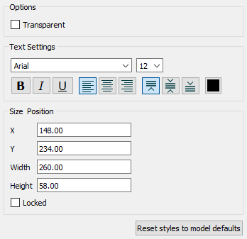
In addition to the standard font selection and Size settings, you can specify the alignment of the text relative to the containing Text box.
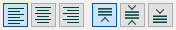
Specify the horizontal alignment (left, center, or right), and the vertical alignment (top, center, or bottom).
Tip: If you're using the text box to add labels to a Causal Loop Diagram (CLD) you should switch to using a Loop Labels instead.