 tool.
tool. , you can also change the appearance of the button, the color of the button and the annotation box, and the text styles on the button and annotation box.
Use annotation buttons to add annotations to your Interface. You can add text, and use it to describe changes to the model, explain model behavior, or add information that doesn't make sense to add to the model itself. You can also add images or videos.
The annotation button is only available on the interface.
tool., you can also change the appearance of the button, the color of the button and the annotation box, and the text styles on the button and annotation box.
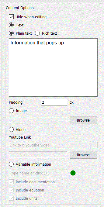
Hide when editing will hide the annotation when you are editing your interface. Once you have set the location and size of the annotation this is helpful for laying out the rest of the page content without having to navigate around the annotation, and matches the appearance of the page after the annotation has been closed when using the interface. This is only available when the button is visible, and you have clicked on the button instead of the annotation.
Text indicates that your annotation will be delivered as text.
Plain text is just what you type, with no bold, italic or font changes. You can still set the font to be used from the Style
Rich text allows you to change fonts and colors within the message and set text alignment. A simple rich text editor will be displayed if you select this option.
For plain text you can embed html tags to customize appearance and add links.
Image will display a picture from a file. Click on the Browse button to select a file. You can select a jpeg, gif, bmp, or png file to be displayed.
Video will show a video with simple controls to start, search, adjust volume and show full screen, or a youtube link (which will embed similar controls). The first frame of the video will be displayed when the user enters a page or opens the annotation from a button. Click on the Browser button to select a video. See Video for a discussion of video formats. To use a youtube link simply paste the link into the editing box.
Variable information will display information about a model variable. The variable name will be shown and then you can select to documentation, equation and units.
Include documentation will show the content of the documentation tab
of the variable's property panel.
Include Equations will show the equation (or equations for a arrayed variable that is not apply-to-all.
Include Units will show the units of measure for the variable.
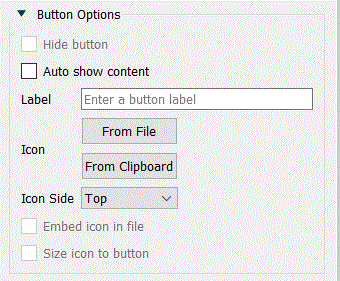
Hide button will make the button invisible, so that the annotation will only be displayed when the interface page is entered. If the button is shown it will appear as any other button and open the annotation. When you first make a button visible it will be placed just below the annotation.
Auto show content will display the content of the annotation when a page is entered. This option is always selected if the button is hidden since there is no other way to open the annotation in this case.
Label is the label that will be displayed on the button. This is only available when Hide button is not checked.
Icon allows you to present an icon for the button. Again this is only available if Hide button is not checked.
From File lets you select an icon from a file to be displayed in the button.
From Clipboard brings the image content from the clipboard. This is only available if there is an appropriate image on the clipboard.
Icon Side determines on which side of the text the picture will be shown. This is only applicable if you've entered text and selected a picture for the button.
- Top will make the picture appear above the text.
- Bottom will make the picture appear below the text.
- Left will make the picture appear to the left of the text.
- Right will make the picture appear to the right of the text.
Embed icon in file will store the icon in the model file directly. This works well for small images, but will make the model file bigger.
Size icon to button will make the image appear in the button. If this is not selected the image will be displayed at full size centered in the button.
You can control the appearance of the button just as you would a button object. See the Button (Interface) and Styles Tab for more details on this. The button options will only be visible if you have made the button visible.
In addition to the button styles, you can set the background color and corner radius on the popup.
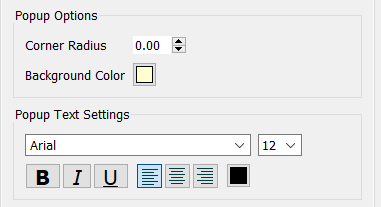
Sets options specific to the popup of the annotation. The popup is displayed when the user enters the screen, or in response to clicking on the button (if it is visible).
Background Color: Click on the color button ( ) to select a color.
Corner Radius: Enter 0 to have the pop-up appear square. Enter a positive radius to round the corners.
Use this to set the font of text inside the popup. It works the same as the standard text settings as described in Styles Tab.
Note The size and position refer to the button. The popup size and position are set by dragging it on the screen.
Click off the panel to commit your changes. You can also set font and color information from the Styles Tab.