The bar graph is a variation of the graph tool that allows you to display values as different height or width bars. The bar graph shows values at a given time, either the simulation time, or the scrub time, as set in the Run Toolbar. If you selected the stacked bar option discussed below you can also display bars at multiple times. As you simulate a model, the bar graph will update.
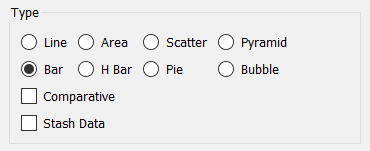
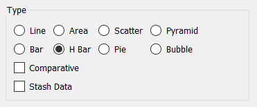
Select the graph ![]() from the Interface Build toolbar, and click on the page at the location you want it to appear (you can also add a page to an existing graph you've already put down). On the graph panel, select type Bar to have the bars be vertical and vary by height, or H Bar to have the bars be horizontal and vary by width, at the top.
from the Interface Build toolbar, and click on the page at the location you want it to appear (you can also add a page to an existing graph you've already put down). On the graph panel, select type Bar to have the bars be vertical and vary by height, or H Bar to have the bars be horizontal and vary by width, at the top.
Then select the variables you want to appear in the bar graph. You can include any variables you want. For more information on adding variables, see Graph Series Property Panel.
You can have the bars displayed vertically or horizontally. To do this choose Bar, or H Bar for the type.
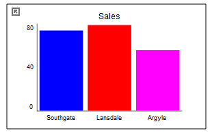
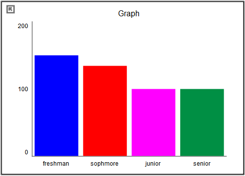
Choose Bar to see values that vary by height:
Choose H Bar to see values that vary by width:
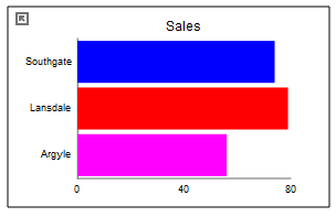
The content, options and styles are identical for the two types of bar graphs.
The options and styles for the bar graph are the same as those for other graphs (seeGraph Styles Tab for more discussion) with additions as noted below.
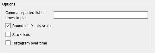
Comma separated list of times to plot allows you to enter a sequence of time values at which to display bars. This option is only available for Bar graphs (not H Bar graphs). There is no limit on the number of time points, but keeping this relatively small will improve the readability of the graphs. If this is left blank then values at either the simulation time, or the scrub time, as set in the Run Toolbar will be shown. If there are multiple bars at each time, they will be grouped to clearly separate the different time points.
This option is only available for Bar (not H Bar). When selected, rather than displaying one bar for each variable in the graph, it will display the variables stacked in a single bar as they are in the Area Graph. There will also be a number of additional options available:
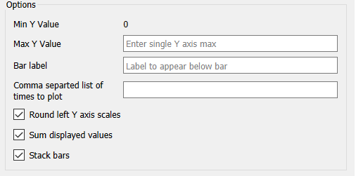
Max Y Value is the global y value across the sum of all variables. Just as with the area graph the minimum value is always 0. The stacked bar graph, like the area graph, is only appropriate for variables that are all 0 or positive.
Bar Label specifies the label to be used for the bar. If left blank, no label appears. When more than one time point is displayed the label is ignored and the time values are used as labels. When the comparative option is selected the run names are used as the labels and this value is ignored.
Round left Y axis scales, if checked, will round the values in the associated Y axis so that the scales are easier to read. If not checked no adjustment will be made.
Sum displayed values, if checked, will show scrub values (displayed by dragging over the bars) that are the sum of the values and those below - matching the y axis values. If this is not checked, the values displayed will be those of each variable. Scrub values will be displayed in the legend, or on the bars if the option for no legend has been selected in Graph Settings Properties Panel.
Stacked bars are a very effective way to display multiple variable comparisons over time and potentially across runs:
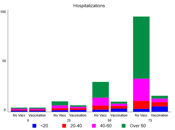
In this case the age groups are array elements, while No Vacc and Vaccination are run names.
The colors for the bars will follow the color sequence set for the model (see Graph Styles Properties Panel), and you can also specify the color used for each variable directly.
In addition to displaying the values of variables, the bar graph can be configured as a histogram when there it contains only a single variable. In this to display the number of times different values occur for a specific variables either across runs (as a comparative graph) or across time. The histogram is a very useful tool for understanding the range and distribution of values.
Histograms can be configured to display the raw count of values, or to normalize those so that the total over all of the bars adds up to one. The latter is very useful for looking at different numbers of runs or times without having to adjust for scale mentally. There is also an option to display a cumulative hectogram.
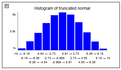
For example, suppose that we looked at values of a truncated normal distribution across time. The raw histogram shows the variable ranges from -10 to 10 and would reflect the full set of values (40,000 in this case).
We can ask to normalize the graph in order to display a probability density function:
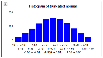
This graph is identical except for the scales. The total of all the bars will now add up to one.
By selecting the cumulate option, we can see the cumulative density function:
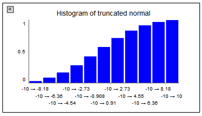
The first bar in this graph is the same as in the previous graph (though the scales are different). Each successive bar is created by adding the value of the bar from the previous graph. Thus, the final bar in the normalized cumulative histogram always has a value of 1.
The options to create and customize histograms are available from the Graph Series Property Panel.
Note The histogram selection is available only when there is a single variable. Once you select histogram you will not be able to add variables.