Interface Settings Properties Panel
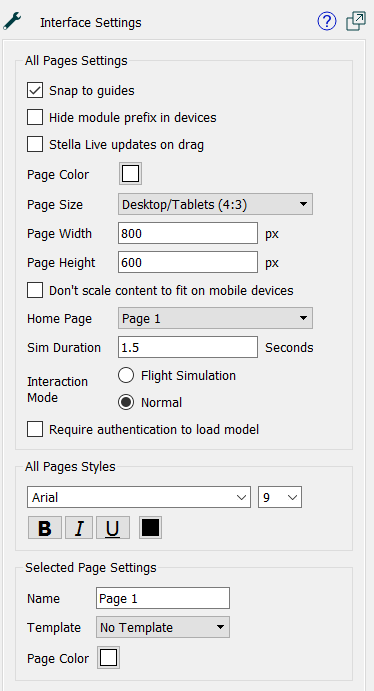
Use the Interface Settings Properties panel to specify settings and styles for interface pages.
To open the Interface Settings, switch to Edit mode and click on an empty space in the model. (If you've closed the Properties panel, you'll need to double-click, or slide it out with the  button appearing at the right of the application.)

All Pages Settings
These settings apply to all pages in the interface.
- Snap to Guides - check this box to turn on guides. If checked, guides will appear when you move objects around the model. They allow you to align one object's center or edge with another's.
- Hide module prefix - check this box to have names in graphs and on tables be displayed without their module prefix (that is, as Population instead of Demographics.Population). Note that if you have specified a display name for a variable, this option will have no effect, as the display name itself is always used.
- Stella Live updates on drag - use this to have Stella Live update all results as the user drags a slider or a knob. If it's not checked, the updates will occur only after the user have finished the drag (released the mouse).
- Page Color - click to choose the default background color for all pages. This can be overridden for a specific page below.
- Page Size, allows you to choose a page size to display the interface at. There are several predefined options that should work well with different types of devices.
- Desktop/Tablets (4:3) will work well for most computers and tablets. The implied width and height of 800 x 600 is small enough to usually not need any scroll bars, but big enough to fit a reasonable amount of content.
- Wide Desktop/Tables (16:9), will work well with wide screen devices and HDTV monitors. The implied width and height of 1066 x 600 may require horizontal scrollbars on other devices.
- Mobile Portrait, will work well on most phones when used upright. The implied width and height of 1245 x 700 will normally be automatically scaled so that little scrolling is needed.
- Mobile Landscape, will work well on most phones when used sideways. The implied width and height of 700 x 1245 will normally be automatically scaled so that little scrolling is needed.
- Custom allows you to set the page width and height directly. You don't actually need to select custom, just fill in values and Custom will automatically be selected.
- Page Width, Page Height - select the width and height for a page.
- Don't scale content to fit on mobile devices, if checked, will prevent phones from trying to adjust the size of the page to fit on the screen. This will make it much more likely that scrolling will be required and should be used only for small page sizes or special purposes.
- Home Page specifies the page the interface will start on when launched from the web (when entering presentation mode, it starts on the page you're on). The default is the first page.
- Sim Duration determines how long (in seconds) the simulation will take when the user asks for a run. use 0 to run as quickly as possible. Experiment to get the results you desire.
- Interaction Mode determines what happens when the user moves a slider or knob, changes a switch, or types in a value while a simulation is running. If Flight Simulation is checked, the simulation will continue using the new value. If Normal is checked, the simulation will pause, and require the user to resume the simulation (using a Resume action).
- Require authentication to load model, if checked, controls access to the published model to users that you have specified. Using this feature requires that you sign up for the protected publishing service on the isee Exchange.
All Pages Style
Lets you specify the font face, size, color, and decoration that will be used on objects placed on pages. You can override this for any individual object using the styles panel for that object.
Selected Page Settings
These apply only to the page you're currently editing.
- Name - specifies the name of the current page. The default is simple Page 1, Page 2, and so on. This can be useful for remembering which page is which, but doesn't affect the published simulation.
- Template - specifies the template to use for this page. Select a template from the dropdown. The content of the template will be visible and active when published or in Explore or Presentation mode. In Edit mode, the template content will not be selectable or editable. To edit it, go to the template page itself. Select No Template in the dropdown to remove the template page.
- Page Color - click to choose the default background color for the page being edited.
Note: The page color is set separately for each page, and will override any page color set in a template.
Note: In stories, the page color only applies if the model view is left transparent.
Note: The page color on a Template Page will not be used in pages the template is used in. It is there only to allow experimentation with different background colors when developing template content.
![]() button appearing at the right of the application.)
button appearing at the right of the application.)